[Stata] How to create the map: maptile package
Stata is probably not the best statistical software for geospatial analysis (yes, there are more tools in R or Python), but many user-created packages in Stata still allow you to easily create maps. Once you have your data, it’s much simpler than you might think.
How do you prepare your data? For starters, you can find my post on how to use the getcensus package to download and use US Census data with ease. What you need is two variables: 1) FIPS code (state, county, zip code, any geographic unit) and 2) your variable of interest.
Before we dive into how to create the map, here’s a list of the various packages for mapping in Stata.
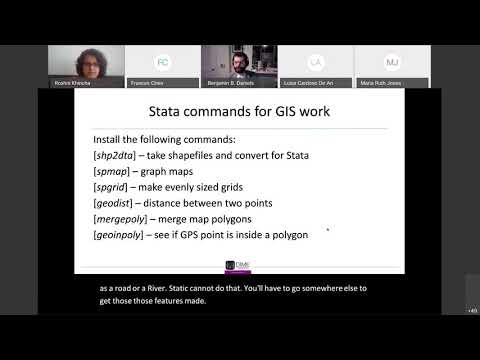
- SPGRID: Stata module to generate two-dimensional grids for spatial data analysis
- SHP2DTA: Stata module to converts shape boundary files to Stata datasets
- GOELEVATION: Stata module to compute elevation for latitude and longitude from Google
- SPKDE: Stata module to perform kernel estimation of density and intensity functions for two-dimensional spatial point patterns
- SPMAP: Stata module to visualize spatial data
- MAPTILE: Stata module to map a variable
- MERGEPOLY: Stata module to merge adjacent polygons from a shapefile
- GEO2XY: Stata module to convert latitude and longitude to xy using map projections
- BIMAP: Stata module to produce bivariate maps
Among these, spmap is the most popular for mapping, but in this post, I’ll outline how to use maptile, which is a very simple way to create a map based on spmap package with a few lines of code!
The slide deck by the developer of the package is well-written if you are interested in: http://files.michaelstepner.com/maptile%20slides%202015-03%20_handout.pdf
Maptile for the univariate map
// Install packages
ssc install maptile
ssc install spmap
Maptile package allows you to import and utilize maps that already exist without having to convert and match background maps separately.
You can just download the background map on the package website. This is primarily limited to the United States and Canada. You can map by State, CBSA, County, and Zip-code, as shown below.

To install, all you need to do is select the geographic units you want to use and then copy and paste the code for installation into Stata.
State-level map
maptile_install using "http://files.michaelstepner.com/geo_state.zip"
rename statefp statefips
// Make sure that the varible name for statefips is named statefips.
// This is a condition for merging with the background map.
maptile varname, geo(state) geoid(statefips) nq(6)
graph export v.pdf, replace
// save the map to pdf format
// You can save in png format as well 
Below is a visualization of implicit bias against Asian Americans by state (note that I created an aggregate variable from Project Implicit‘s 2017-2021 data).

One thing to note here is that the number of bins varies depending on the nq(#). The default setting is 6, which means that the data is automatically divided according to the 6 categories. On the other hand, you can also manually set the cutoff point at which the bins are split via the cutpoints or cutvalues options.

By specifying the rangecolor (specify a color range), fcolor (specify a color scheme) options and the number of nq, you can generate very different maps with the same data.
maptile varname, geo(state) geoid(statefips) rangecolor(pink*0.1 pink*1.2) nq(2)
maptile varname, geo(state) geoid(statefips) fcolor(Greens2) nq(10) 

You can see the list of the color schemes and its color (based on spmap package) here: http://repec.sowi.unibe.ch/stata/palettes/colors.html
For ordinal variables, you can choose sequential color palettes.

For categorical variables, you can choose qualitative color palettes.

One of the things I love about maptile is how easy it is to create a state-level hexagon map with just one line of code. All you need to do is change the commands after geo, as shown below. Then, you can specify a string variable with a name (by default, it is set to two letters of the state abbreviation) that you want to overwrite. If you look below, you can see at a glance that a few states, like WI, KY, and SD, had a high implicit bias against Asians.
maptile_install using "http://files.michaelstepner.com/geo_statehex.zip"
// You need to install the base map only the first time
maptile varname, geo(statehex) geoid(statefips) nq(6) 	labelhex()
You can find more hands-on exercises on using statehex in the article below. I strongly recommend that you follow along with this post.
Stata graphs: Hex maps of the 2020 USA Presidential elections
County-level map
maptile_install using "http://home.uchicago.edu/~cmaene/geo_county2014.zip", replace
// install the base map (only once)
maptile varname, geo(county2014) fcolor(GnBu) nquantiles(5) twopt(legend(lab(2 "<20th") lab(3 "20th-40th") lab(4 "40th-60th") lab(5 "60th-80th") lab(6 ">80th")))
// Add the label manually
You can also assign a name for the label to display the legend, as shown above.

Since my data has many counties with high standard deviations because many counties have small sample sizes, I used the drop if command before maptile command to visualize these counties as “No data.”
drop if cnty_asian_imp_count<10
maptile varname, geo(county2014) fcolor(GnBu) nquantiles(5) twopt(legend(lab(2 "<20th") lab(3 "20th-40th") lab(4 "40th-60th") lab(5 "60th-80th") lab(6 ">80th"))) 
You can add or remove the title or legend using the following command.
maptile varname, geo(county2014) fcolor(GnBu) nquantiles(5) twopt(title(Title here) legend(off))
// You can put the title using"title()" option
// You can remove the legend by using legend(off) option
Last but not least: Clustering methods

As the professor developed the maptile package mentioned in the slide, visualizing a map is (especially how to set linebreaks) more an art than a science. The spmap package provides the K-means clustering method to create the clusters, but it has the limitation that the criteria for determining the number of clusters (k) could be somewhat manual and arbitrary (See this post from Google).
Nonetheless, there are many different machine learning-based clustering methods (see this post) or latent class analysis methods, you could use a more statistical approach to determine the number of clusters and visualize them on a map after running the clustering and then creating the categorical or ordinal variables based on the clustering results. For an explanation of LCA, please see the post below.
Stata also has a wide range of commands for clustering. You can visit here to learn more about the cluster analysis: https://www.stata.com/features/cluster-analysis/
Additional Resource

1 Response
[…] [Stata] How to create the map: maptile package […]